Stay in the loop
Be the first to hear news and updates from The Creative Branch
Brand strategy
Brand identity
Graphic design
Gilkes, the Hydropower Specialists, is a company with a rich history and a well-established reputation. As a leader in an industry where projects can span decades, it was crucial to evolve their brand while maintaining their proud heritage. Gilkes sought a brand evolution—not a revolution—to retain their long-standing clients while appealing to new audiences.
Reviewing a brand for a company as established as Gilkes posed a unique challenge. The goal was to modernise the brand without compromising its sense of gravitas and tradition. Given the slow-paced nature of the hydropower industry, brand changes needed to be carefully considered to avoid alienating long-term clients who had built relationships with Gilkes, sometimes over generations.
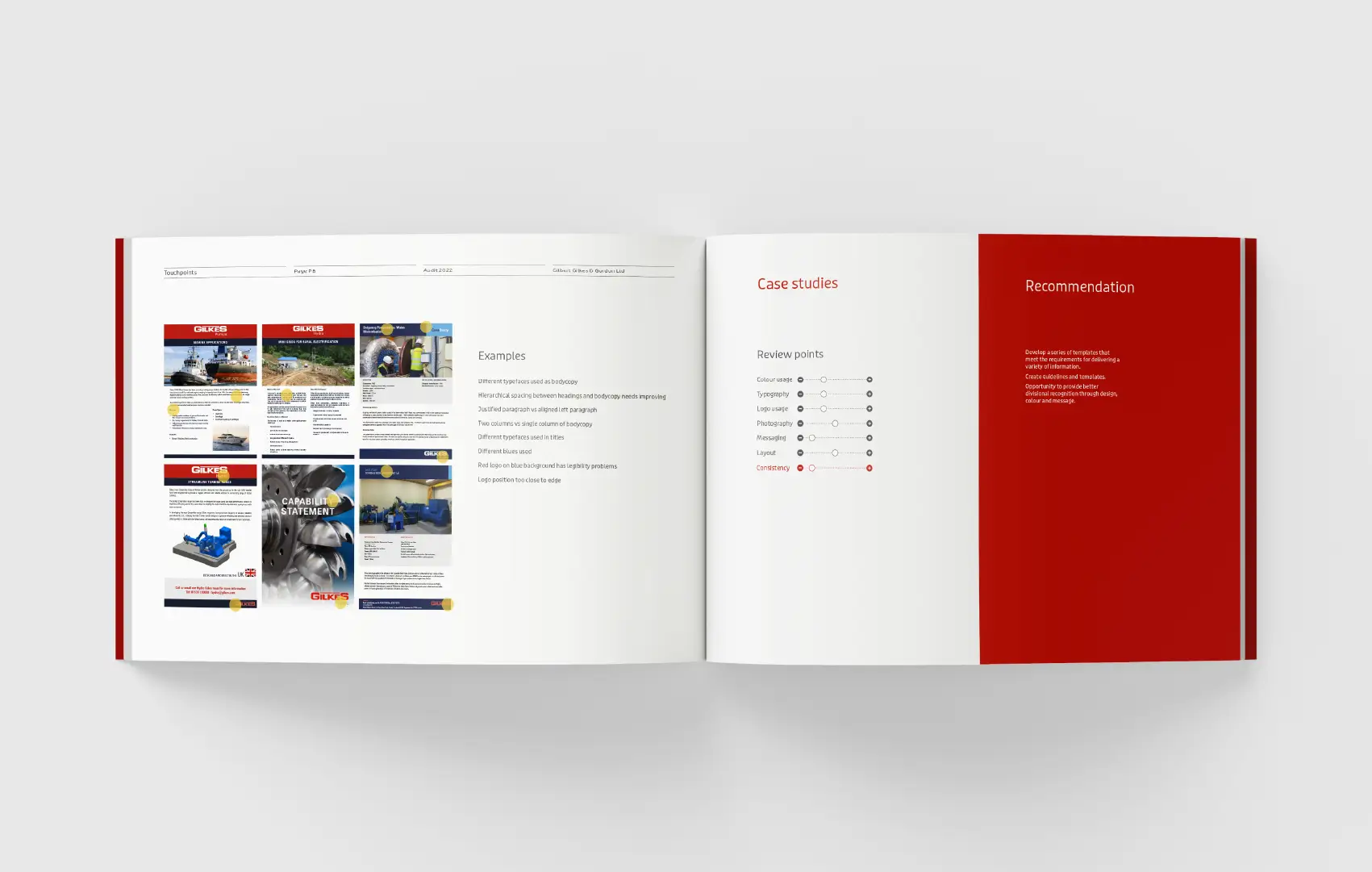
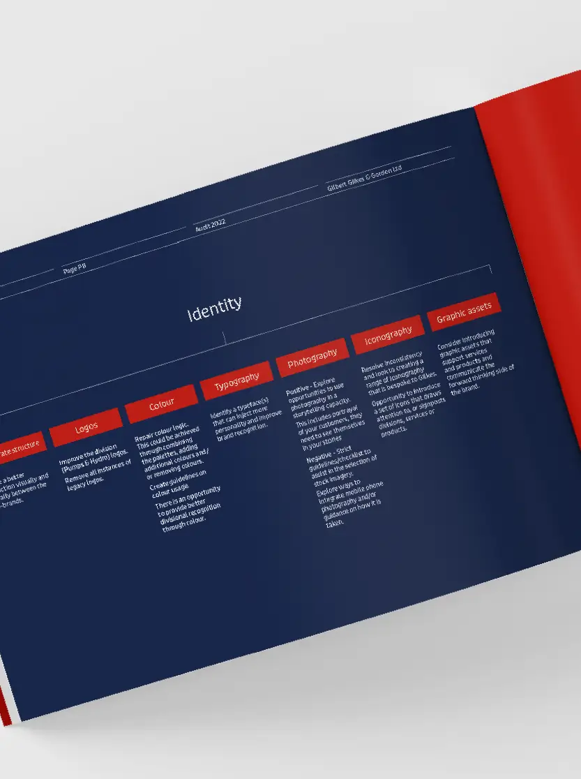
Consistency had become an issue as previous brand updates and guidelines were outdated and no longer relevant to current applications. Gilkes needed a fresh perspective to ensure they stayed ahead of competitors and continued to resonate with both existing and new clients.

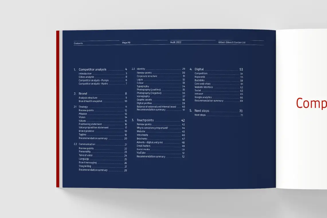
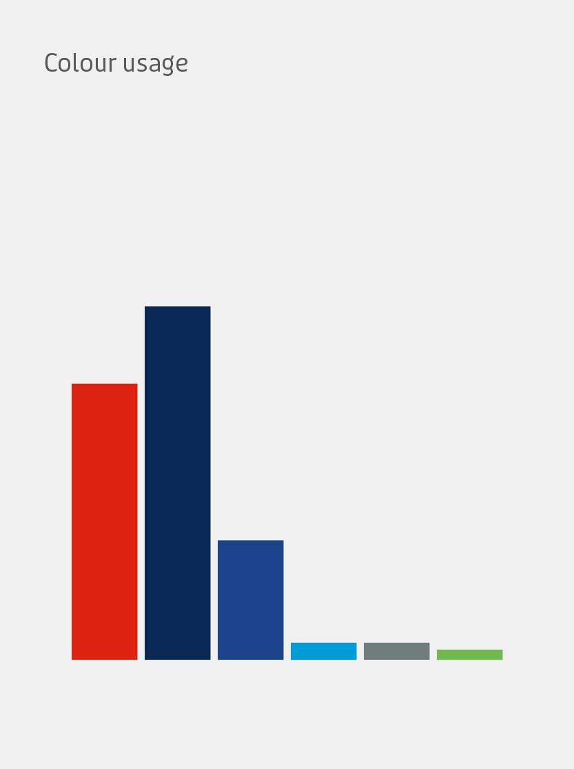
Competitor analysis: Conducted a thorough review of competitors to identify gaps and opportunities for Gilkes.
Tone of voice: Evaluated and refined the brand’s tone of voice to ensure it was consistent and aligned with Gilkes’ values.
Applications: Reviewed all brand applications to ensure uniformity across various touchpoints.
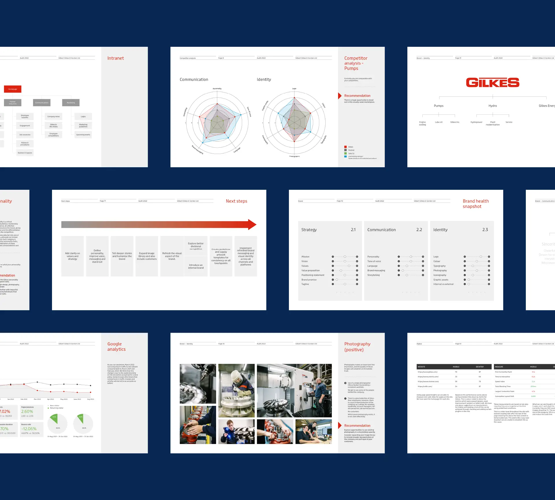
Colour palette: Updated the colour palette to modernise the brand while retaining its core identity.
Digital platforms: Assessed digital presence to ensure a cohesive and engaging online experience.
Photography: Curated a consistent photographic style that reflected the brand’s strength and innovation.
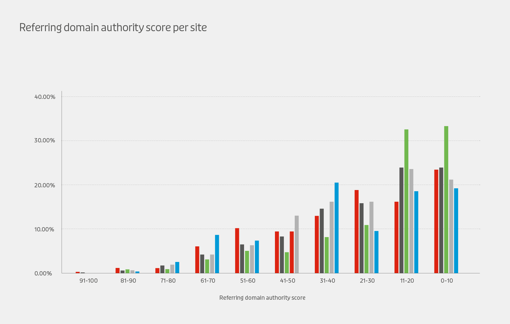
Utilised tools including Semrush and Hotjar to gather data and insights, informing our strategy and ensuring a data-driven approach to the brand audit.
Developed short, mid-term, and long-term strategies to guide the brand’s evolution. These strategies will ensure that Gilkes remains a powerhouse in the industry, continually growing stronger.

The brand audit for Gilkes resulted in a long term strategy to deliver a refreshed and cohesive brand identity that will honour their history while positioning them as leaders in the industry.
The updated tone of voice, colour palette, and photographic style will provide a modern touch without losing the brand’s established gravitas.

Manufacturing and engineering
Brand strategy
Brand identity
Graphic design
By implementing a strategic roadmap, Gilkes is now equipped to maintain brand consistency and continue to appeal to both long-standing and new clients. The brand evolution will enable Gilkes to keep pace with competitors, ensuring their continued success and strength in the hydropower industry.